Color is having a moment in Thousand Oaks kitchens. Homeowners are starting to move away from everything all-white and leaning into warmer, more expressive spaces. If you live in a home built in the 70s, 80s, or 90s, you might already be wondering how to refresh the look without going too bold or too trendy. It’s a common question, especially when you want a kitchen that still feels right ten years from now.
Here’s the good news. Today’s color trends are flexible and surprisingly easy to adapt. You can try deeper shades in focused areas, soften other parts of the room, and still end up with a kitchen that feels modern, comfortable, and true to your home’s style.
In this guide, we’ll walk through the color ideas showing up in Thousand Oaks right now and how you can use them in a way that feels personal, practical, and welcoming.
Why Color Matters in a Thousand Oaks Kitchen Remodel
Kitchens in this area often get a lot of natural light, especially in homes with windows that face the hills or open to the backyard. With that much sunlight, color makes an immediate impact. A warm neutral can calm the space. A deeper shade adds depth. A soft blue cools down late-afternoon light.
Most families here use the kitchen as a daily hub. Breakfast, homework, quick bites between activities, weekend gatherings, it all happens in the same space. So, color isn’t just a design decision. It affects how the room feels at different times of day.
Because many local homes were built decades ago, color can also help refresh an older layout before you take on larger updates. The right shade can soften original finishes or highlight features you plan to keep. And when you’re thinking ahead five to ten years, these grounded colors give you personality without locking you into a fad.
Trending Color Palettes for 2025 Kitchens
Color trends shift every year, but a few palettes feel especially well suited for Thousand Oaks homes.
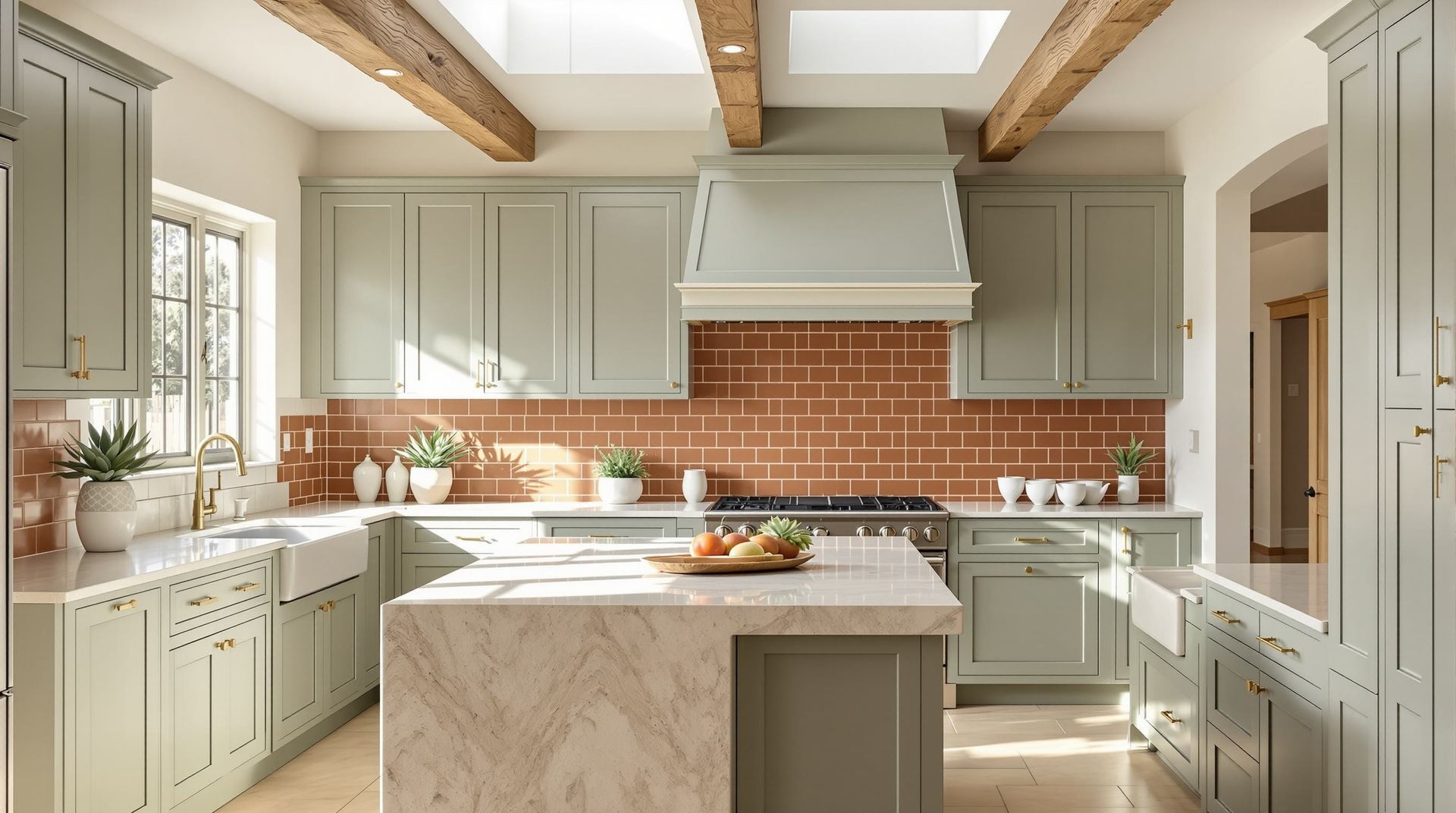
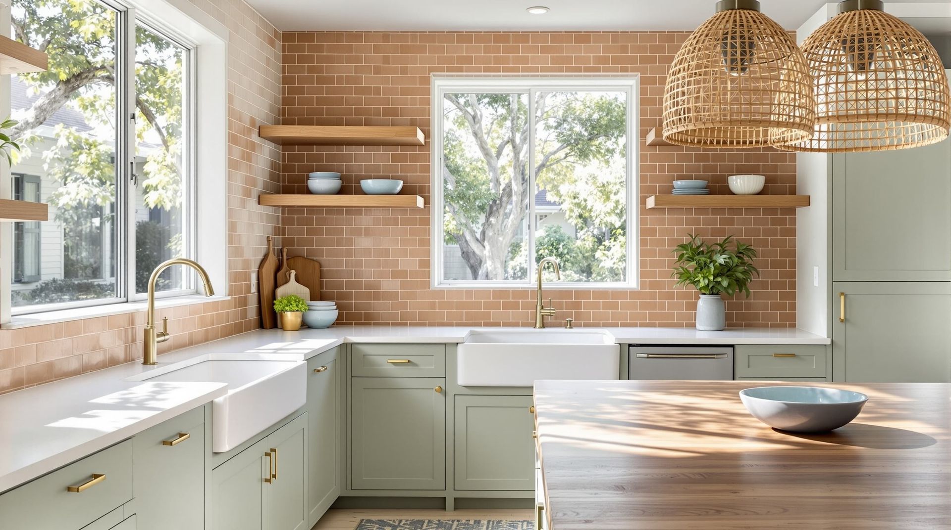
Earth Inspired Neutrals
Warm taupe, clay, mushroom, soft almond, and similar tones work beautifully with the existing style of many Conejo Valley homes. These shades connect naturally with warm flooring, wood trim, and traditional cabinet lines you often see in older layouts. They’re calm and grounded but still updated.
If you like neutrals but want something beyond white or gray, this palette hits a sweet spot.
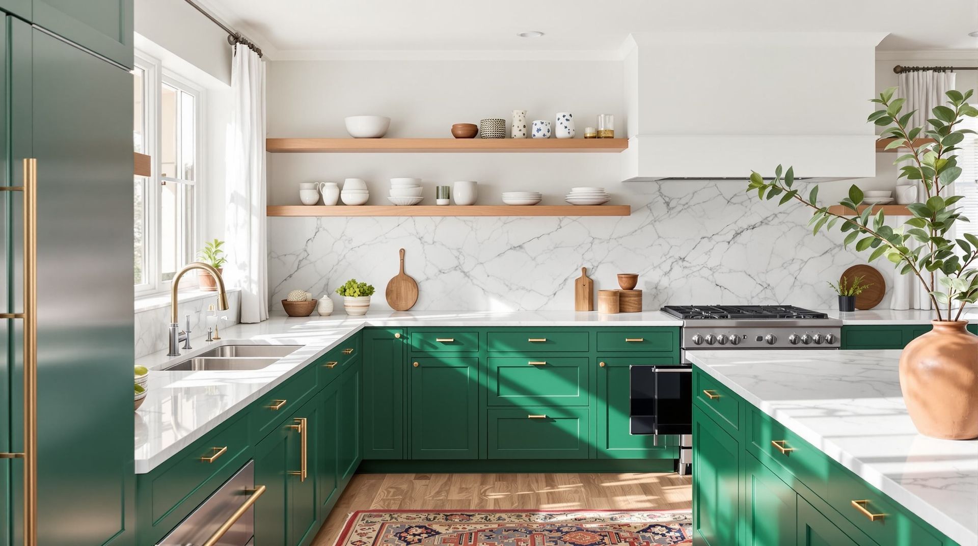
Bold Accent Colors
Deep navy, forest green, charcoal, and even wine-inspired reds are showing up more often. You don’t need much to make them work. A single cabinet wall or an island can shift the entire mood.
If bold feels risky, pair deeper tones with light countertops and a simple backsplash. This keeps the look strong but balanced.
Soft Coastal Blues and Greens
These colors feel right at home in Southern California. Think sage, misty blue, pale aqua, or soft sea glass. They bring a calming atmosphere without feeling overly delicate.
If your kitchen gets strong afternoon light, these cooler tones can help the room feel brighter and more relaxed.
Color Trends That Complement Thousand Oaks Architecture
Most Thousand Oaks neighborhoods are filled with homes built between the 1970s and 1990s, and these homes often share a few features. You’ll see galley kitchens in earlier builds, peninsula layouts in 80s homes, and more compartmentalized rooms before open-concept trends took over.
Color works best when it fits these original structures. For example, if your home has darker wood trim or older medium-toned floors, warm neutrals or deeper shades often feel intentional instead of forced. In homes with vaulted ceilings or skylights, you can lean into more saturated colors because the space already feels open.
Even if you plan to remodel more extensively later, color can help you modernize the space today. Maybe you introduce a soft neutral on the perimeter cabinets, then use a rich green or blue on the island. Or you experiment with color through a backsplash before committing to painted cabinetry.
Matching color to your home’s architecture isn’t about rules. It’s about finding what feels natural for the space you already have.
Using Color Strategically: Where Bold Works Best
A lot of homeowners like the idea of color but aren’t sure where to start. Here are the most reliable places to use deeper shades.
Cabinetry Choices
Cabinets are the most visible part of the kitchen, so even a subtle shift goes a long way. If you want something timeless but still stylish, try using a light neutral for the uppers and a deeper tone for the lowers. This combination adds structure without overwhelming the room.
If you’re fully committing to a bold cabinet color, balance it with lighter countertops or tile. This keeps the look grounded and inviting.
Kitchen Islands
The island often acts like furniture in the room, which makes it a great place for saturated colors. Deep greens, blues, or charcoal tones create a focal point that feels purposeful and refined.
Backsplashes, Hardware, and Fixtures
If you’re exploring color but not ready to commit fully, small changes help you test what you like.
- A colorful tile backsplash can brighten the space.
- Hardware in brushed gold, matte black, or soft bronze adds character.
- Fixtures like pendant lights or faucets introduce color or contrast without major changes.
Pairing Color With Materials
Color works best when it aligns with the materials around it. Here are a few ways to make everything feel cohesive.
Wood Tones
Both oak and walnut pair beautifully with modern palettes. Lighter woods work well with deeper greens and blues, while darker woods complement warm neutrals and soft whites. If your home still has original wood tones, color can either highlight them or help redirect attention to newer finishes.
Countertops
Light quartz and natural stone counters balance strong colors nicely. Softer whites and gentle grays keep the look clean. If your cabinets are bold, a counter with simple veining helps the space feel calm and coordinated.
Flooring
Whether you’re keeping existing floors or planning new ones, think about how they interact with color. Warm floors and cool colors sometimes clash unless the shades are softened. Cooler-toned floors like light oak or washed gray give you more flexibility.
Lighting and Natural Light Considerations
Thousand Oaks sunlight changes the look of color throughout the day. Morning light can make warm colors glow, while evening light can deepen cool tones. Always test samples in different areas and at different times. Move them around and check them alongside flooring and counters.
A layered lighting plan helps too. Under cabinet lights, pendants, and recessed lighting keep color consistent and prevent shadows from distorting the shade.
How to Explore Color Trends Without Regret
Color feels easier when you approach it with curiosity instead of pressure. Start with samples. Place swatches near your cabinets, flooring, and appliances. Watch how the colors change throughout the day.
Here’s another tip. Try pairing your sample colors with the types of finishes you like. For example, if you prefer brushed gold hardware or warm quartz counters, look for colors that harmonize with those tones.
Working with a design team can also help you narrow things down.
If you want guidance while you sort through color palettes or layout options, the team can walk you through what works best for your space, your lighting, and your plans for the future. You can explore that process here: kitchen design.
Bringing Trends to Life in Your Thousand Oaks Kitchen
Here’s a simple way to move from idea to action.
- Gather inspiration from photos, showrooms, or your neighborhood.
- Think about how you use the space every day.
- Look at your home’s style and what you plan to change.
- Try a few color combinations and see what feels right.
A color you love in a sample might surprise you when paired with your flooring or countertops, so take time to test and adjust. Once the right combination clicks, the whole design starts to feel clearer.
If you are starting to picture how these color ideas could look in your own kitchen, this is a good moment to explore next steps. You can see what a full transformation involves here: kitchen remodeling.
Conclusion
Color trends give Thousand Oaks homeowners a fresh way to update tired kitchens without committing to a complete overhaul. When you choose shades that work with your home’s natural light, layout, and materials, you get a kitchen that feels personal and timeless. Small changes can make a big difference, and thoughtful choices will guide your remodel with confidence.
If you want support along the way, Westside Remodeling is here to help you explore what feels right for your home. Contact us to start planning a kitchen that feels both personal and timeless.